Get ready for a pretty spooky recap of the best and worst ads that we have spotted this month.
Nobody likes long intro so let’s get to it!
THE GOOD
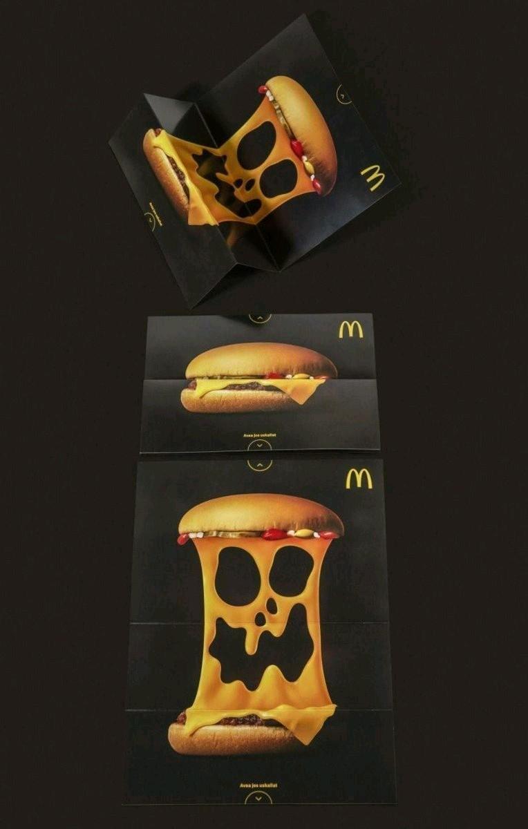
Starting with McDonald’s Halloween campaign.
We love the creativity and the simplicity of both the foldable flyers and the poster. The poster creative especially as it’s very clean and would stand out nicely in the feed as well.
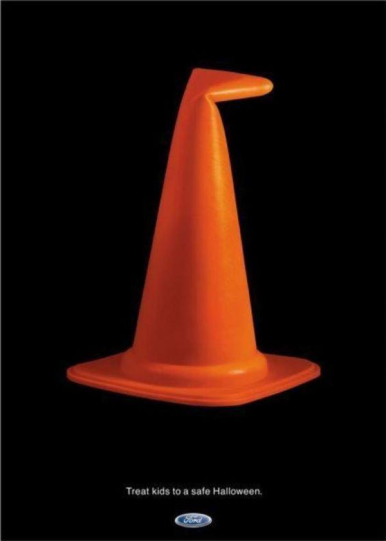
Next up is Ford.
Again, clean and simple. Using the “damaged” cone to illustrate a witch’s hat, linking it back to the car industry is clever and ties nicely with their message.
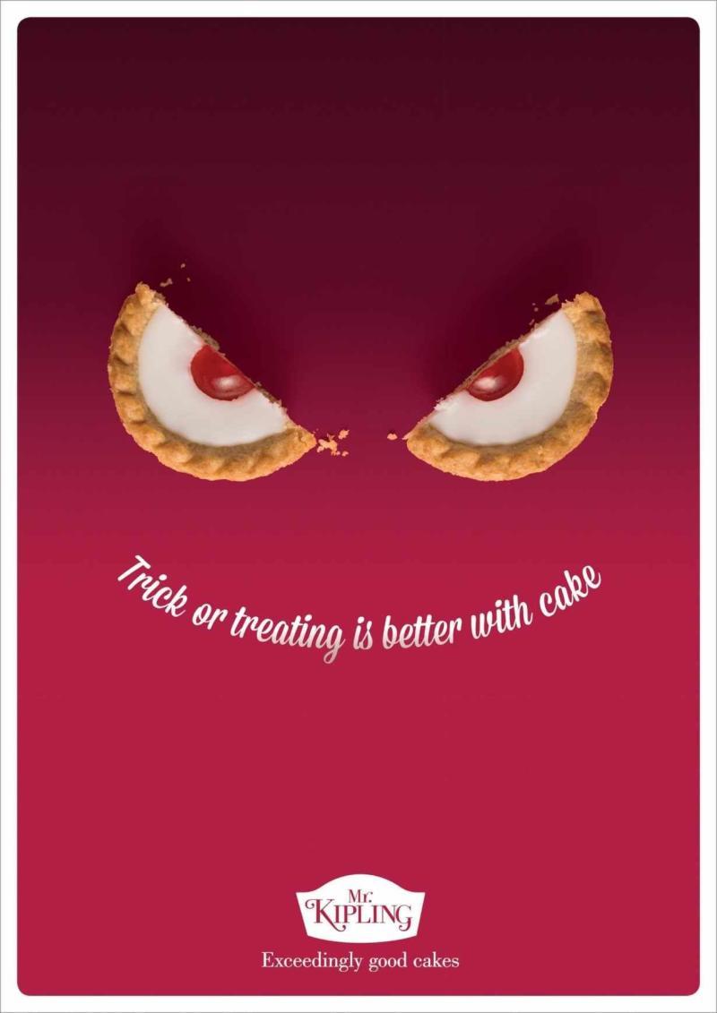
Mr.Kipling
continues in a similar style using their product and smart text placement to create an illusion of an evil monster. Pretty on point in our eyes.
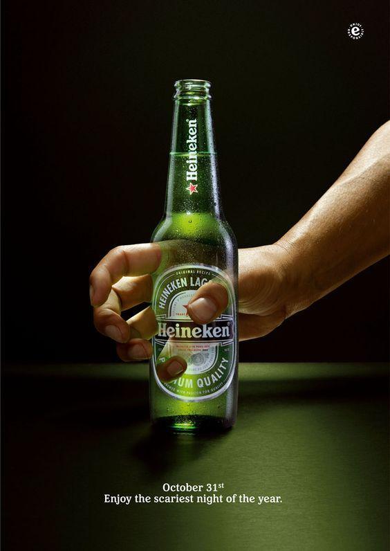
Heineken’s ad
is still pretty clean with a single focus point but definitely not as simple as the others when it comes to execution.
Budweiser
decided to go with the “Drink Wiser” route reminding their customers that what happens on Halloween might turn into a nightmare that lasts way beyond 31st October.
The image of the woman is definitely eye-catching thanks to it’s shock-value (not the usual model you see on an ad) and the message is also very visible and easy to understand.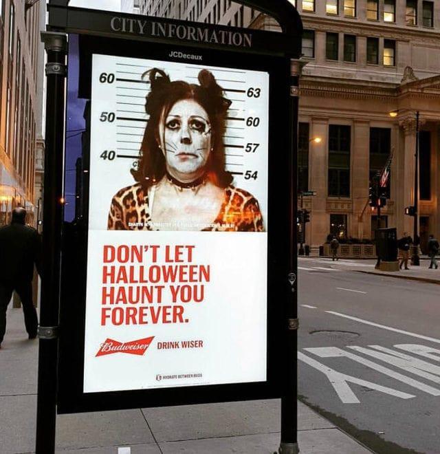
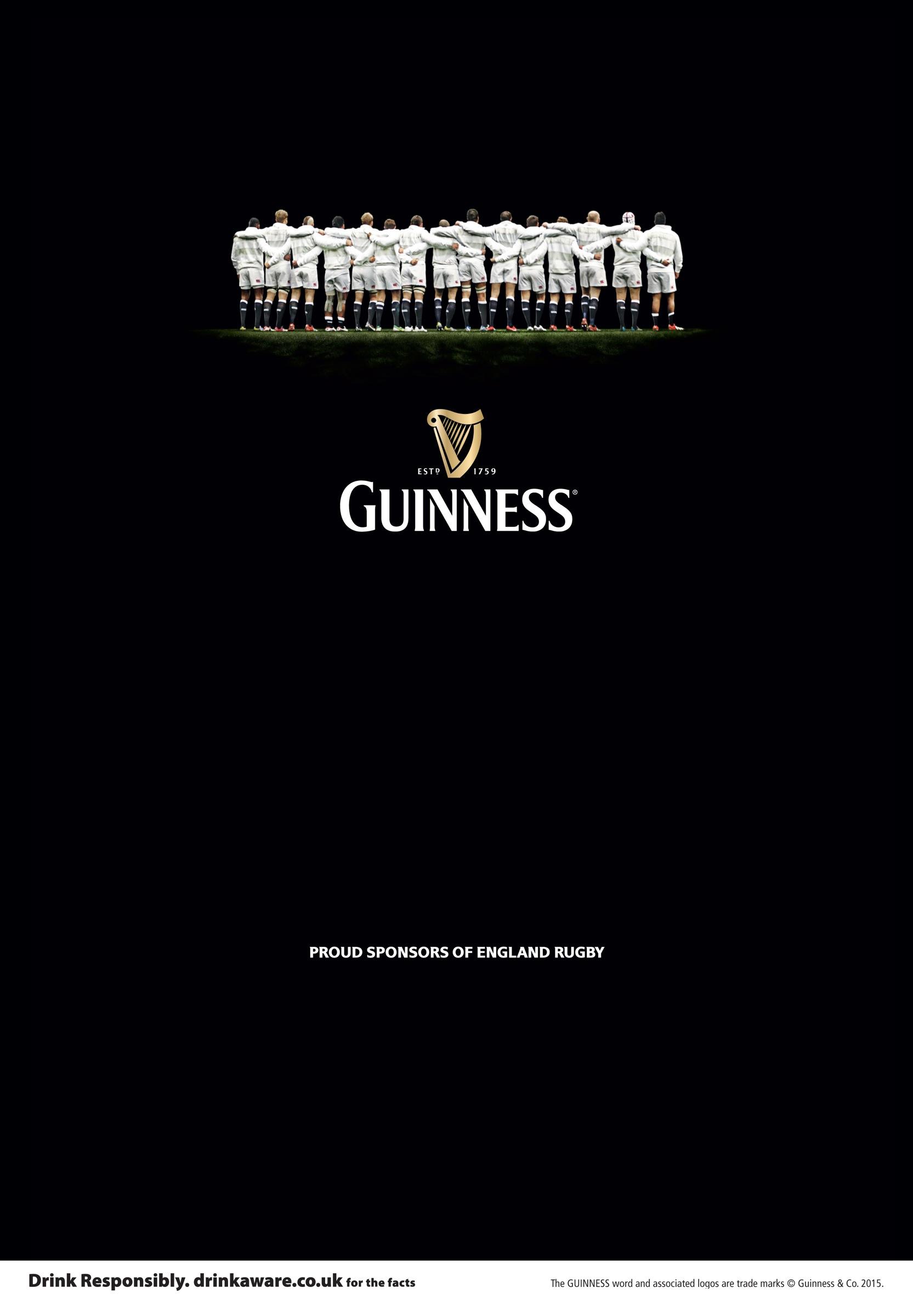
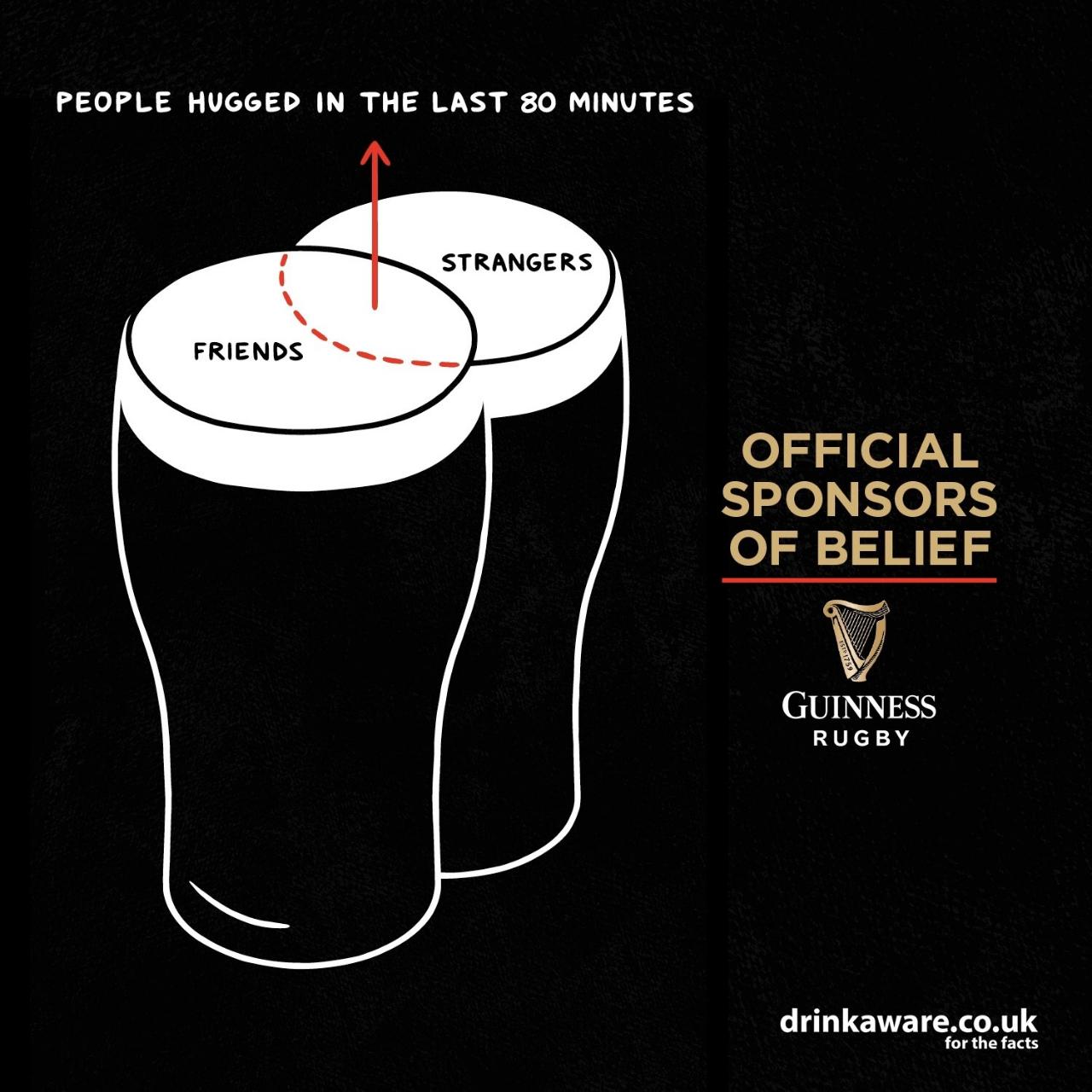
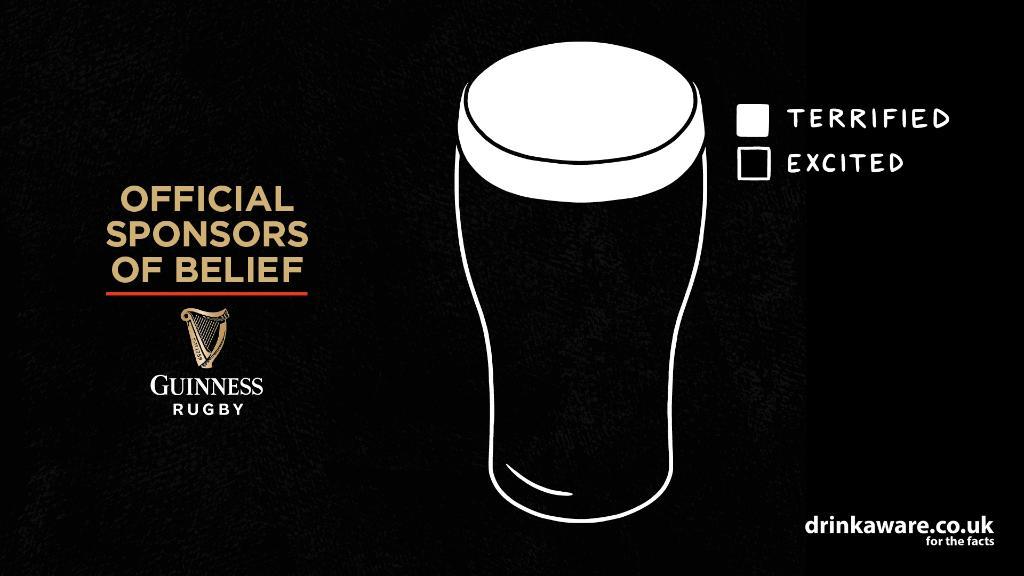
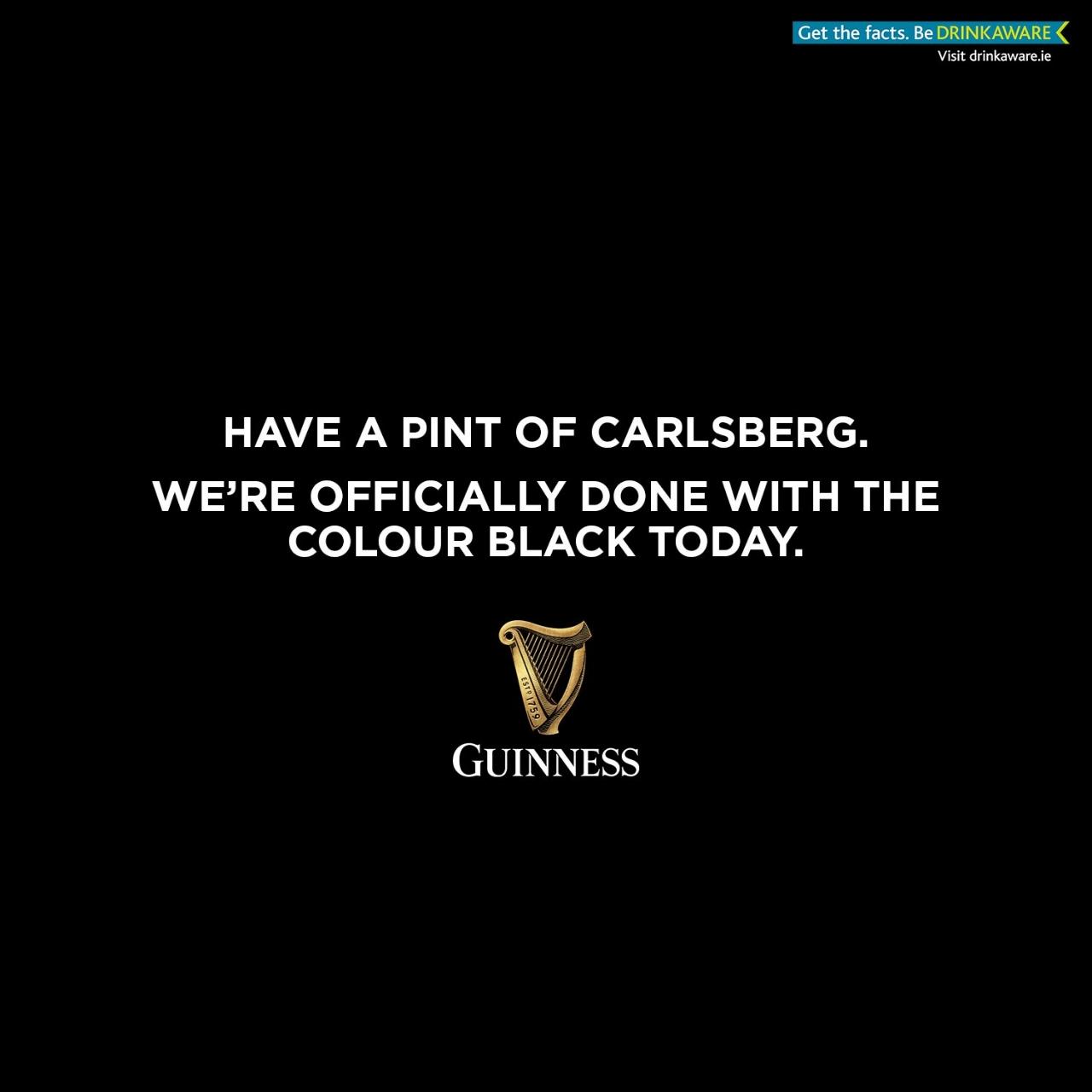
From one beer to another, next up is Guinness
and from Halloween to rugby. For those that don’t live in the UK or care very little for rugby, let us provide you with some context. England played South Africa last weekend in one big epic rugby match that they…lost.
Many brands jumped on the rugby bandwagon but none of them did it as gracefully as Guinness with a series of ads using their product (beer) in smart ways to show support to the team or relate to sports fans. Plus, they added a bit of self-deprecatory humour after England lost jokingly encouraging sports fans to get competitor’s beer.
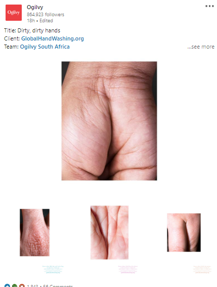
Global Hands Washing’s campaign
by Ogilvy is VERY eye-catching…and for the right reasons even if it might not seem so at a first glance. Ogilvy used the fact that our brains tend to generalize whatever they see to their advantages making a series of pictures using hands in various suggestive close-ups to raise awareness around washing hands.
THE BAD
This time, we have just one bad ad…and the winner is:
Oribi
The copy is not bad…but the creative is just…confusing. Who is that woman, why is she slightly blurry, why does she take up most of the ad space, why is she looking at me…are they trying to say that she is struggling with analytics? Why is she so happy? Will we be this happy after using Oribi…confused.