We have received a lot of lovely feedback on our August edition of the “Best & Worst Ads” so it’s clear we are not the only ones who are always curious “how other people do it” and look for inspiration.
So welcome to the next edition of this series and without further ado, let’s dive in!
THE GOOD
This one is by Glossier
and it’s simple yet effective. Let us tell you why.
Glossier brand is all about minimalism and being genuine. The ad itself follows that ethos: they are using a less conventional model (who could easily be their customer), they are showing the model applying the product in not too overly glossy (pun intended) way how other brands do in their commercials making it seem more authentic, and their use of colors in the ad is also quite smart (grey hair, brown backdrop) so it looks like a better quality footage of a customer doing her makeup, showing the product in its natural habitat which makes it instantly more trustworthy. Also, notice how they zoom on the model’s face and the overall model’s position – this together with the vertical format makes this ad really pop in the feed because as you scroll, you suddenly see her face and it makes you pay attention.
Well done Glossier!

Next up: Adobe
We love these Spanish ads from Adobe. They are colorful, fun, and use the asset’s space very well.
The only thing we would improve is the copy. Putting the “Cursos gratis….” sentence on the next line would increase the space copy would take in the feed and make it easier to read as well.
LinkedIn was in our bad list last time…
So it’s only fair we include it in our best list this time as they produce a lot of good ads too.
The ad uses an overlay that zooms in and out on the person within the asset this means that the ad drastically changes color within a few seconds which really stands out in the feed.
The issue with video ads on LinkedIn is that if you click on them, they don’t take you straight to the website and you only pause the video – unlike with static webclick ads where a click on the image equals a visit to the website. So you are making it a little bit harder for people to get to the website, which is probably why they included the link in the copy as well.
This is a bold one from Audible
Oh, Audible. You cheeky bugger. We love you for this one.
Many companies shy from political statements or anything remotely controversial. Which is why when a company actually steps out the “safe zone” it really gets noticed. And in case of this little ad, for all the right reasons.
We love a good customer story. But it’s not the only reason Tableau Software…
made our “good list” this time. It’s also how this little ‘case study’ is executed. When you get a customer speaking on your behalf it’s always powerful. Tableau Software makes a strong punch with this one because it puts the name of the very recognizable customer, Coca-Cola, in the forefront of both the copy and the assets, and then has their customer say the right things and the right amount of things for people to want to find out more. It makes us completely forgive the random Coca-Cola glass getting filled in the middle of the ad.

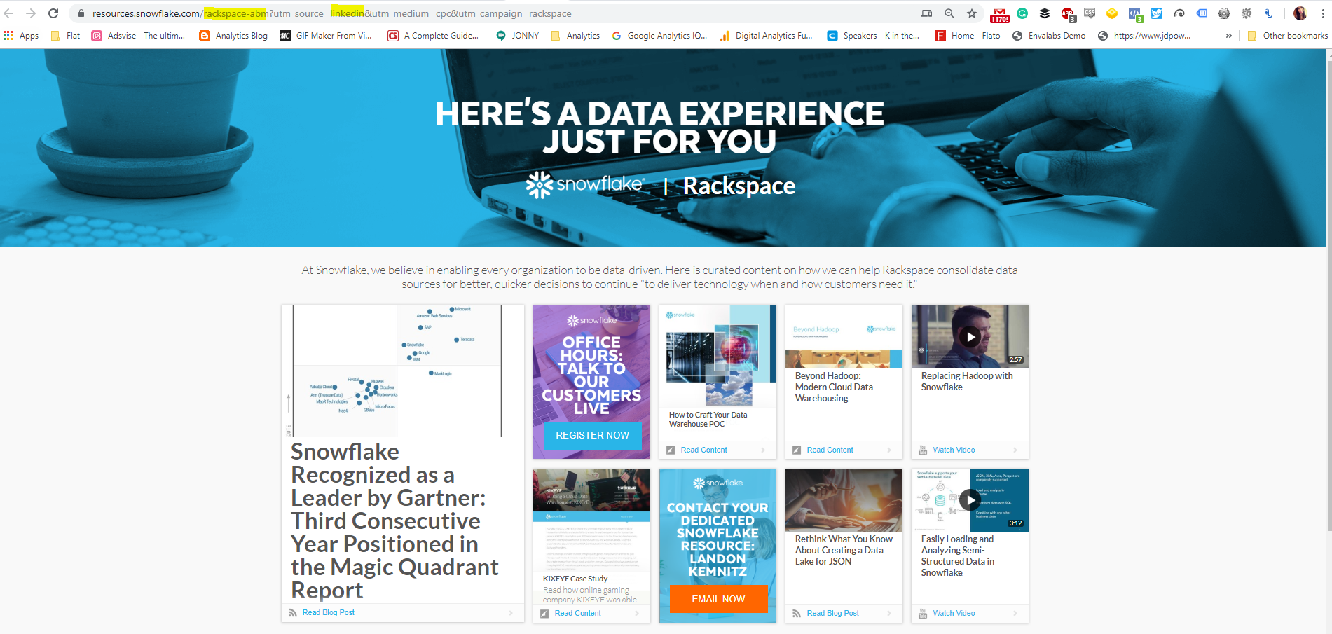
You might have never heard of Snowflake, but they are pretty smart with their ads
…judging by their creative and landing pages. Of course, we can’t see the targeting so it’s hard to tell how successful these ads are but if they nailed that too, they should be hitting at least high CTRs.
Snowflake created very simple ads for each location/brand that featured their name and then created a unique page with curated content that featured the location or the brand. They also UTM their links properly to be able to measure their ads’ ROI more efficiently.
This is smart as you can do it on a small budget, can replicate the ads easily, and by making ads personalized, can have high conversions.
The only thing we would improve on is the website as there are a lot of things to look at and can be hard to digest.
The Ad

Landin Page for the Ad
This one made us tear up a bit…
Burger King, you have done it.
You have done the smartest move and actually supported your competitor for a cause that matters. Why is it smart? It shows a few things:
- The confidence Burger King has in its products and customers
- The knowledge Burger King has about its audience and latest trends (younger audience being more about sustainability, causes etc.)
- The great eye for imagery because just look at the ad, it’s emotionally charged and powerful
- The punchline is that this ad has probably generated more awareness and brownie points for Burger King than the cause has for McDonald’s – whether that was the intention or not
Last but not least, Facebook…
The video is snappy and gets to the point. Plus, we love that it shows what you get out of the course through the little phone “get more sales, get more likes, get more messages” mobile graphic that makes it come alive a bit and captures people who are looking to do just that with their ads.
THE BAD
Well…what to say about this one…
They tried to do something more creative with the copy but the ad is clearly missing an image and has no UTM…

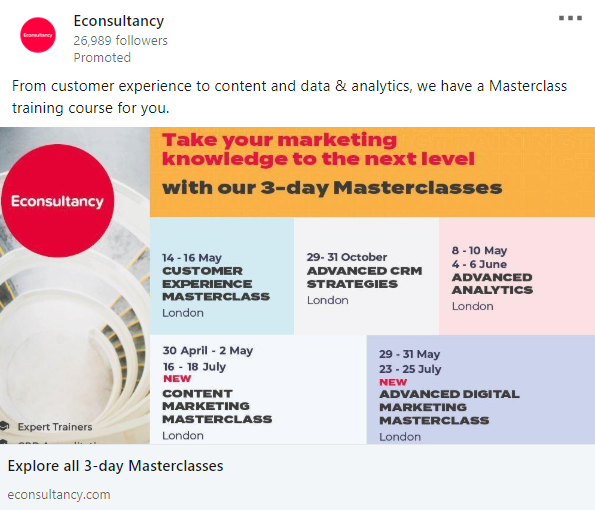
Usually, we love everything Econsultancy does.
But this ad is a bit…too much.
We assume they just wanted to cram as much information into one ad as possible but the result is a busy and confusing image which get across very little unless you dedicate quite a bit of brainpower to it.
Making something simpler that summarizes the gist of what they are trying to offer would definitely make things clearer and easy to understand. If they want to make it more specific, they could always go with a list of classes within the copy (nicely formatted) and leave the visual cleaner with “London Marketing Masterclasses” or something like that.
Where do we start with Gett Business Solutions...
Do you know what this company does just by looking at this ad? Probably not. We didn’t know until we got to the website.
Either way, there are other pressing issues with this example:
- There’s a rarely a good reason to include hashtags in an ad. The usual function of hashtags is to make your post more visible among people who search/use those hashtags. With paid, you are paying for that exposure so having hashtags in the copy is completely redundant AND only offers more space people can accidentally click on and be taken AWAY from your ad. In other words, it can only hurt you.
- The same applies for tagging people in your ad. Usually done just for brand deals but again, you won’t get any benefit out of including tags in your copy, especially if they are not working as in the example below.
- The ad was targeted at us but we know very little about the company or its CEO so this ad is completely lost on us. Nobody cares about your CEO unless they are widely known among your target audience. What would be more interesting is to lead with the topic of the discussion instead (although not sure we are the target for that either)

And that’s a wrap! See you next month and feel free to send us any cool or less cool ads you have spotted!
Petra
Petra has 8+ years in digital marketing, working for companies like Square Enix, lastminute.com, Pinkberry, Blackberry, BRITA, and Fujitsu. Her expertise is mainly in paid media (social, display, Adwords), social media strategy and implementation, for which she has won a few awards as well.


